
Data analysis is a complex field. Even for those of us who have dedicated our lives to studying data and statistics, it can be easy to get tripped up. For those who are wading into the world of data analysis, it’s simply not possible to expect to understand every single concept. But there are some terms that get thrown around in data analysis that — in my experience — are misunderstood more often than not. One of those terms is bias-variance tradeoff.
I’d like to clarify what the bias-variance tradeoff is. But more importantly, I’d like to examine why it’s so badly misunderstood so often.
What is Bias-Variance Tradeoff?
The odds are good that when you’re designing a research project, you’re working within a set budget. (This applies almost everywhere; very few analysts enjoy the luxury of an unlimited budget.) Because of this constraint, you have to make some choices as you plan your work. In the case of impact assessment projects, you must decide which is more important: optimizing bias or variability.
- Errors caused by bias are, effectively, the difference between the average prediction of our model and the actual value we’re trying to predict
- Errors caused by variance are down to the variability of predictions for any given data point.
There is no safe answer here. To improve one of these things (bias or variance) you have to make the other worse. Want less bias in your data? You’ll have to settle for more variance. Looking to reduce variance? Be prepared for more errors due to bias. People generally like RCTs because they tend to produce results with low bias — but now you know there’s a tradeoff there.
So What’s the Problem?
Many experts use a graphic visualization that resembles a target to explain the bias-variance tradeoff.

There are two issues with this explanation.
It’s Misleading
I’ve been educating journalists and nonprofit leaders about this for a long time. This kind of graphic is incredibly misleading and leads people to make decisions that are different than those they actually intend.
The dots on those targets? Those are not individual data points. Those are entire studies. Glancing at visualization, most people assume each dot represents an individual response to a survey or treatment. In fact, each dot is a whole RCT (or whatever kind of study you’re conducting). Surprise!
It’s Not Realistic
The target representation makes it look really easy to choose the best option. Obviously, you want dots on the target. But in most cases, we don’t know where the real-world target is compared to the dots. (If we did, we wouldn’t need to run the study!)
Take a look at the visual again with the targets removed. Now, which one is the best?
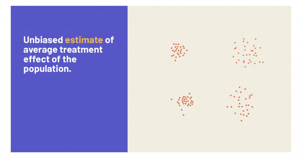
This more realistic version, combined with the understanding that each dot represents an entire study, probably changes your ideas about the bias-variance tradeoff. (And your thoughts on how and where to allocate budget dollars!)
How to Address the Bias-Variance Tradeoff
Honestly, understanding it is the most important part.
Low variance (high bias) models are often overly simple and lacking in parameters. In contrast, models with many complex parameters are likely to produce low bias, but high variance. Armed with that knowledge, you can choose which is more suitable for your project.
Still not sure? Want some expert input on how to best measure the impact of your work? Datassist is here to help. Our team of data experts is committed to helping nonprofits, journalists, and social sector organizations tell their data story in a way that is both honest and compelling. Get in touch with us today to discuss your project.


